
Most of the barriers that shut people with disabilities out of a website are not deliberate. They are small, repeatable oversights: a color a shade too light, an image with no description, a button a keyboard cannot reach. That is good news, because a fixable problem is a solvable one. For a fuller plan, follow the steps to make a company more accessible from the ground up.Here are the mistakes that turn up most often in real audits, why each one matters, and how to correct it.
What “accessibility” actually means (a quick refresher)
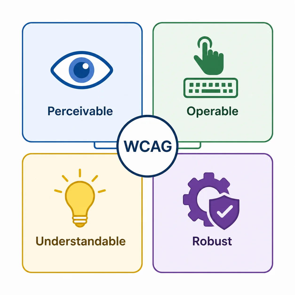
Digital accessibility means designing and building so that people with visual, motor, auditory, and cognitive disabilities can perceive, understand, and use your product. That includes someone browsing with a screen reader, a person navigating by keyboard because a mouse is difficult, a user who needs captions, and a visitor who enlarges text to 200%.
The global reference standard is WCAG, the Web Content Accessibility Guidelines from the W3C. WCAG organizes its criteria around four principles, often shortened to POUR: content should be Perceivable, Operable, Understandable, and Robust. Nearly every mistake below maps back to one of those four ideas.
The most common accessibility mistakes companies make
These are the issues that surface again and again. Each one is common precisely because it is easy to miss.
Low color contrast
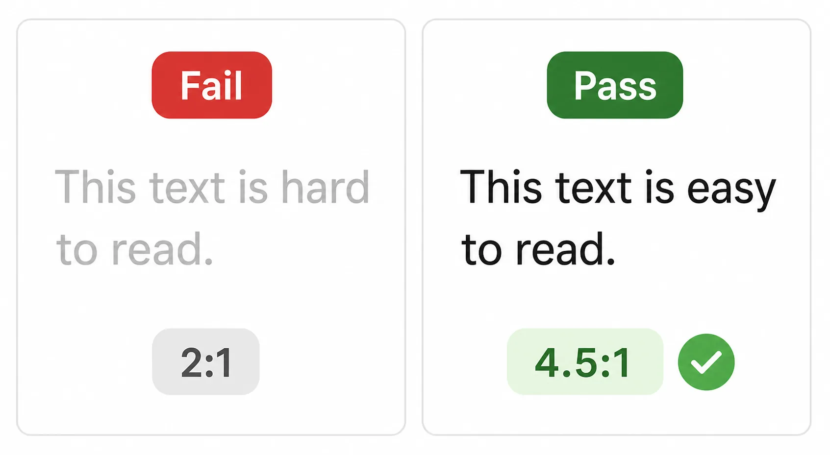
Text that sits too close in tone to its background is hard to read for people with low vision, color blindness, or anyone on a phone in bright sun. Light gray body copy and pale text over photos are frequent offenders. WCAG asks for a contrast ratio of at least 4.5:1 for normal text and 3:1 for large text. Fix it by checking foreground and background pairs with a contrast tool, darkening light text, and never relying on color alone to signal meaning (for example, marking a required field only in red).
Missing or useless alt text
Images that convey information need alternative text so screen readers can describe them. The mistake shows up in two directions: images with no alt text at all, and alt text that is unhelpful. Descriptions stuffed with keywords, padded to be needlessly verbose, or reduced to a generic phrase like “business team meeting” all fail the user. Write concise, specific alternatives that describe the image’s purpose, and mark purely decorative images with empty alt text so assistive tech skips them. Oregon State University’s guide to the top accessibility mistakes made by content authors is a clear, practical reference for both alt text and heading habits.
No keyboard access or keyboard traps
Many people cannot use a mouse and navigate entirely by keyboard. If a menu, form, slider, or modal can only be operated by clicking, those users are locked out. Worse is a “keyboard trap,” where focus enters a widget and cannot leave. Test by putting the mouse aside and tabbing through the whole page. Every interactive element should be reachable, usable, and escapable using the keyboard alone.
Missing visible focus indicators
Keyboard users need to see where they are on the page. Designers sometimes remove the browser’s default focus outline for aesthetic reasons and never replace it, leaving those users lost. Keep a clear, high-contrast focus style on every link, button, and field so the current position is always obvious.
Unlabeled form fields and controls
A form input without a properly associated label is a guessing game for a screen reader user, who may hear only “edit text” with no idea what to type. Placeholder text is not a substitute, because it disappears on entry. Give every field a real, programmatically linked label, and make sure icon buttons and custom controls expose an accessible name.
Empty links and buttons
Links that read only “click here” or “read more” give no context when a screen reader lists them out of order. Icon-only buttons with no text label, and links wrapped around an image with no alt text, produce the same silence. Write link text that describes its destination, and give every control a meaningful, spoken name.
Poor heading structure and page semantics
Screen reader users often navigate by jumping between headings, much like sighted users skim. When headings are chosen for their visual size rather than their meaning, or skip from an H1 straight to an H4, that map falls apart. Use headings in a logical order that reflects the true structure of the content, and rely on real semantic elements (buttons, lists, landmarks) rather than styled <div>s pretending to be them.
Auto-playing media and missing captions
Video without captions excludes deaf and hard-of-hearing users, and audio-only content without a transcript does the same. Auto-playing video or sound also disorients screen reader users and people with cognitive or vestibular conditions. Caption your videos, provide transcripts, and never auto-play media without an obvious way to pause or stop it.
Relying on overlay widgets or automated scanners to “fix” everything
One of the most expensive mistakes is believing a single tool solves accessibility. Automated scanners are useful, but they detect only a portion of issues. Third-party “accessibility overlay” widgets that promise instant compliance frequently fail to deliver it and can even interfere with the assistive technology a user already relies on. Automation is a starting point for finding problems, not a substitute for fixing the underlying code and testing with real users.
The mindset mistakes behind the technical ones
Treating accessibility as optional or a one-time project
When accessibility is a task someone does once before launch, new content and features quietly reintroduce barriers. It works far better as an ongoing standard baked into everyday work than as a cleanup effort you revisit every few years.
Treating compliance as the finish line
Meeting WCAG is the floor, not the ceiling. A page can pass automated checks and still be frustrating to use. The goal is a genuinely usable experience, not a certificate.
Never testing with disabled users or assistive technology
You cannot fully understand a screen reader experience by reading about it. Teams that never test with real assistive tech, or with disabled users, miss problems no scanner reports. Even occasional testing with a screen reader and keyboard surfaces issues quickly.
Meeting WCAG is the floor, not the ceiling. The goal is a genuinely usable experience, not a certificate.
What is the main goal of an accessibility audit?
An accessibility audit is a systematic evaluation of a site or product against WCAG, combining automated scanning, manual expert review, and testing with assistive technology such as screen readers.
The main goal is to identify and prioritize the real barriers that prevent people with disabilities from completing tasks, so those barriers can be fixed. It is not about producing a compliance badge for its own sake. A good audit tells you what is broken, who it affects, how serious it is, and what to do first. Because automated tools catch only a share of issues, manual and assistive-technology review are essential parts of any credible audit.
How to build accessibility in so these mistakes don’t recur
Fixing today’s problems matters, but stopping them from returning matters more. Most of that groundwork needs a budget owner behind it, and getting decision-makers to fund the fix is its own five-step conversation. Bake accessibility into the places where decisions get made:
| Where | What to do |
|---|---|
| Design system | Define accessible color pairs, focus styles, and components once, so every team inherits them. |
| Content workflows | Make alt text and sensible heading structure a standard step in publishing, not an afterthought. |
| QA and testing | Add keyboard and screen reader checks to your regular quality process, and test continuously rather than once. |
| Procurement | When you buy or adopt third-party tools, ask for their accessibility documentation before you commit. |
| Ownership | Name who is responsible, so it does not fall through the cracks. |
For a mission-driven organization, this is an extension of the work itself. Accessibility is how you make sure the people your mission exists to serve can actually reach it. Building inclusive AI also means ensuring that the technologies and systems organizations develop are accessible and usable by everyone. Inclusion that stops at the login screen is not inclusion.
Frequently asked questions
Is there a “common accessibility mistakes companies make” checklist?
What is the main goal of an accessibility audit?
Do I have to meet every WCAG guideline?
Can an overlay or automated scanner make my site accessible?
These mistakes are common for one reason: they are easy to overlook and easy to fix. Start with the biggest offenders on your most-used pages, correct them, then make accessibility a routine part of how you build. The barrier you remove today is a person you welcome tomorrow.